Proven Guilty is out in May 2006, but we’ve got the cover art 5 months ahead of its release date. Check it out!
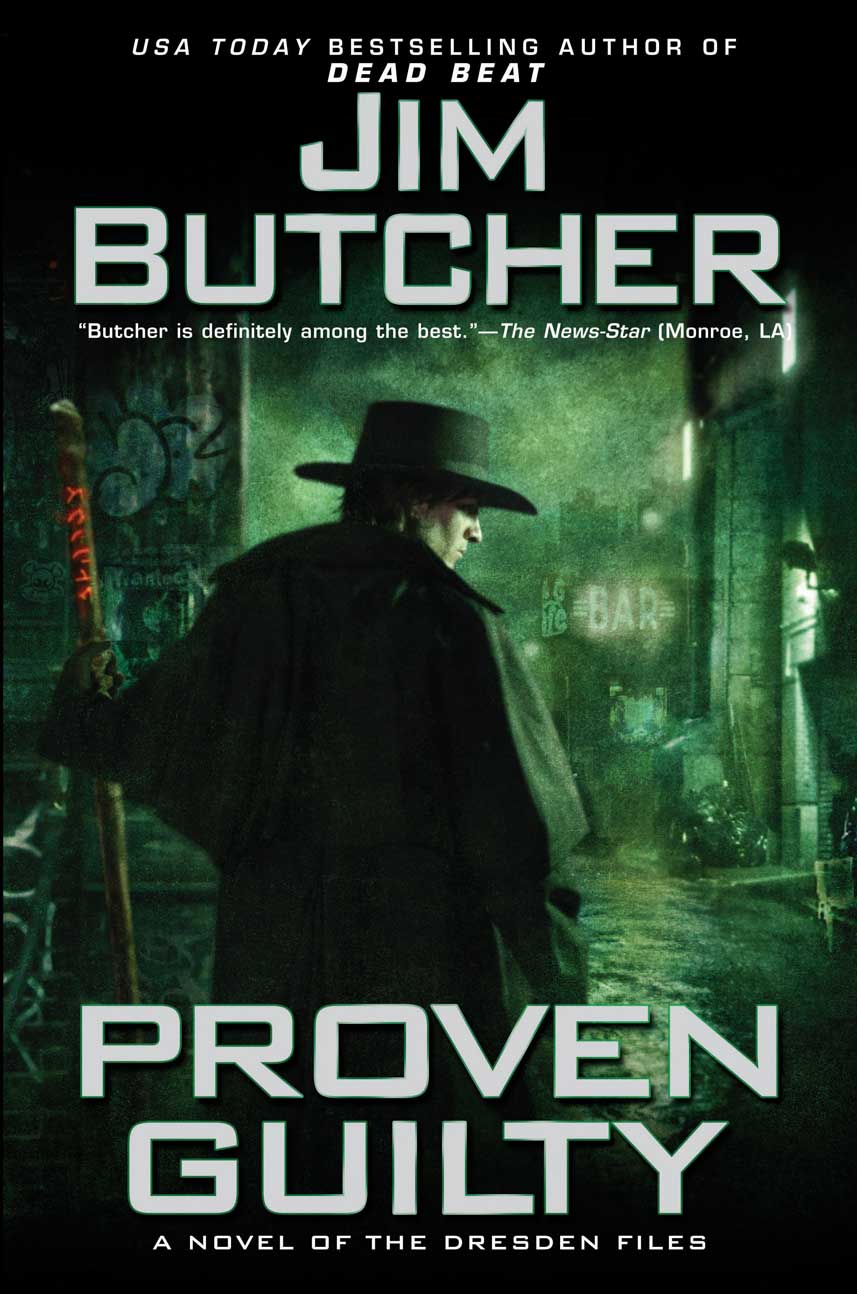
(click on the image to get a larger version!)
The Online Site For Everything Jim
Proven Guilty is out in May 2006, but we’ve got the cover art 5 months ahead of its release date. Check it out!
Comments are closed.
That’s lovely! And it makes a nice connection to Dead Beat!
it looks awesome! I love how they’re portraying Harry in all the nastier bits of Chicago. They did it for Dead Beat, and now Proven Guilty as well. It’s great.
Very cool.
At least this one does not say “Fashion Chimp” in the background…
kicks ass. very neat!
looks great! love the work on this one and Dead Beat.
I love this cover! Of course, Dead Beat was my favorite of the previous covers, so that’s to be expected 🙂 Actually, I think this one is the best yet!
that is pretty cool. Think we can get a wall paper format like we did for dead beat?
That is pretty cool. Do you think we could get a wall paper version like we did for dead beat?
Shiny! 😀
It’s awesome. I can just FEEL the atmosphere. It makes my fingers itch to hold the book. I’m in the middle of re-reading BLOOD RITES right now, and I’m dying to get ahold of the next book! I just wish that DEAD BEAT would come out in paperback so I could have a uniform set…
I still like the old covers better. They were different. This one is. . .too much like Dead Beat. Enough so that when I saw it I thought, ‘Why am I looking at Dead Beat again?’
I don’t like it- It is alomst a duplicate of of deadbeat before this all the covers hav ebeen different and unique. i’ll still read it but this disapoints me.
I like it! I’d also love a wallpaper version.
I like it. I loved the older covers too, but it’s cool to actually see the main character again. Actually, it’s rather appropriate.
In the early books, the evils are decidely *external*. Following Death Masks, Harry’s stuggles with darkness have become increasingly *internal*. At present I would say that his harshest battlefield is his own mind, and the cover art reflects that.
PS: Anyone else getting a bit of a Hugo Weaving-“V is for Vendetta” vibe? (Maybe it’s the hat…*wink*)
First thing I thought was Deadbeat with a green background… I mean I like green better than purple… but Dresdan could have at least been at a different angle…
I like it, even if it is similar to Dead Beat. The green really made me think of noxious gases, adding to the freaky factor of the slummy neighbourhood. Good cover!
I like it, even though it is similar to dead beat. If you look at them next to each other they actually look opposite, and that adds a weird efect.
I think its a great depiction of Harry, totally sets the mood. Dead Beat is slightly sim..but this has a feel all its own. I like having Harry on the cover, I like being able to take a look at a Butcher approved photo of the world he created.
I like it, but….what’s with the hat? I don’t remember Harry a hat often enough to be on two covers >.>
guys, guys!…
Some people seem to think it’s too similar to Dead Beat. Personally, I think that’s the point. I love the compare/contrast approach the art department has taken on this one. And I LOVE cover art that actually looks like the artist has read the manuscript.
The pure beauty of this cover is the subtleties – particularly the ways in which it relates to it’s immediate predecessor and to the things that are ongoing in Harry’s life: his stance is different – his shoulders just slightly more bowed under an unseen weight; he’s in what looks like an even more dangerous part of town – the very air itself looks as though it’s pulsing with menace; there is a glove on Harry’s hand and – oh yeah – as opposed to the cover of Dead Beat, the runes on his staff are GLOWING RED!!! I dunno. I think that might be kinda, ya know, SIGNIFICANT? *grin*
I’d also very much like to read the book NOW please. ;-D
NOW.
c.